Redesigned a gold buying app to help first-time investors start saving with confidence
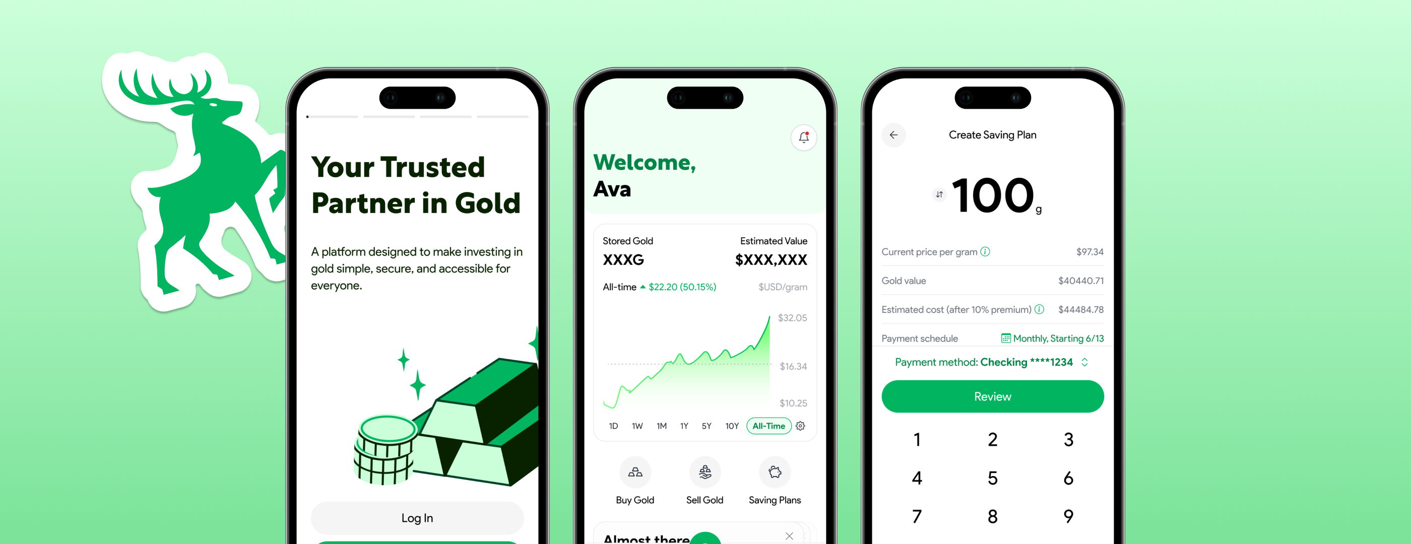
Vaulta had a website and app for buying gold, but both felt incomplete and looked years behind any modern finance product. This was a full brand refresh and mobile redesign built to reach people who've never bought gold in their life.
Problem
Unfinished, dated, and built for the wrong audience
Vaulta already had a website and mobile app for buying gold, but neither one was finished. Key features were missing, and what did exist looked and felt years behind any modern finance app.
The business wanted a full brand refresh and mobile redesign, one that could stand up next to the finance apps people already trust, and reach a younger, wider audience than gold buying has traditionally pulled in.
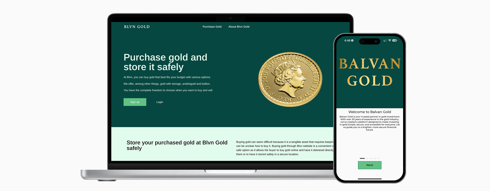
Old Vaulta (previously Balvan Gold) Web and App UI
How might we design a gold buying app that feels current and approachable to a first time buyer, without losing the trust a financial product has to earn?
Research
Borrowing trust from apps that already have it
I hadn't designed for finance before this, my own reference point was Robinhood as a user. Since the goal was reaching a new kind of buyer, I focused my research on finance apps already known for doing onboarding and trust well, rather than on how the existing gold-buying audience currently shops.
A smooth first five minutes was the priority
Modeled onboarding after Revolut, since early friction is what makes new finance users leave before they buy anything.
The client's goal was a wider audience, not a familiar one
Robinhood and Revolut had already reached the young, first-time investors Vaulta wanted, so staying close to those familiar flows mattered more than originality.
Gold needed personality it didn't have
Gold doesn't have much built-in visual interest as a category, so I added illustrations, animation, and clean data visualization, following Wise and Robinhood's lead.
Buying gold isn't quite like buying stock
Gold is a physical asset, so its traditional buying process differs from a stock or ETF, though I adapted it into a flow familiar to modern investment apps.
Every one of these came back to the same tension: build something a first-time buyer trusts immediately.
Design
Three decisions, one unfamiliar category
Tab navigation
Problem: Gold buying doesn't map cleanly onto a standard finance app's structure, so it wasn't obvious which tabs earned top-level space.
Landed on Home, Gold Prices, Saving Plans, and Settings, with Buy Gold set as the primary call to action rather than folded into a tab. Saving Plans got promoted to the top level after the client flagged it as the actual primary sales driver, not a secondary feature.
What I didn't go with
An earlier version gave Buy and Sell equal, easy access in the tab bar. I dropped that to just Buy, both to simplify the nav and to keep the emphasis on driving new purchases.
Saving plans
Problem: Asking someone new to gold to make one big purchase is a hard sell, so the app needed a way to build the habit gradually.
The setup flow mirrors the buy flow, so it feels like the same product rather than a bolted-on feature. Plans can be edited or canceled, and the details page leads with a growth chart of the plan's value, since that's what keeps someone motivated to keep saving. Editing sits one tap away, secondary but never hidden.
Onboarding
Problem: The existing onboarding felt messy and intrusive, and it was missing screens a modern finance app is expected to have, like Face ID setup and notification permissions.
I went through the original flow step by step to see what was actually necessary and cut what wasn't, then added what was missing. Ordering mattered as much as content, the sequence had to hold up without losing someone halfway through.
Worth noting
Face ID and notification permissions didn't exist in the original app at all. Both are standard in the apps I benchmarked against, so adding them wasn't optional if Vaulta wanted to feel current.
Outcome
Still a prototype, not a product
Vaulta hasn't shipped. The screens are done through a working prototype, but development hasn't started, and the product will likely shift before it's built under its final name.
What exists right now is a full click through prototype covering the core flows: buying, saving plans, navigation, and onboarding, built against the standard that apps like Revolut and Robinhood already set. It hasn't been tested with real users yet. It gave the client something concrete to react to and approve before any code got written.
Reflection
Looking back
What I'd do differently
My research leaned entirely on modern finance apps, and not relying much on how people typically buy gold today. With more time, I'd want to actually look into that, not to rebuild the flow around it, but to make sure the modern version didn't quietly drop something people expect when they're buying a physical asset, not just a stock.
A few things this project made clearer:
Familiar over novel, on purpose
The client's whole goal was reaching a broader, younger audience. So the smart move wasn't a wholly original interface, it was leaning on flows people already knew from Robinhood and Revolut, then adapting only where gold itself actually demanded something different.
Designing for a product that isn't final
Nothing here was locked during the project. The brand, the flows, even the app's name were still moving (Vaulta is the current guess), so the prototype had to carry the intent clearly enough to survive changes I couldn't predict.