Redesigned Twitch's mobile app to help viewers stay connected to the communities they follow
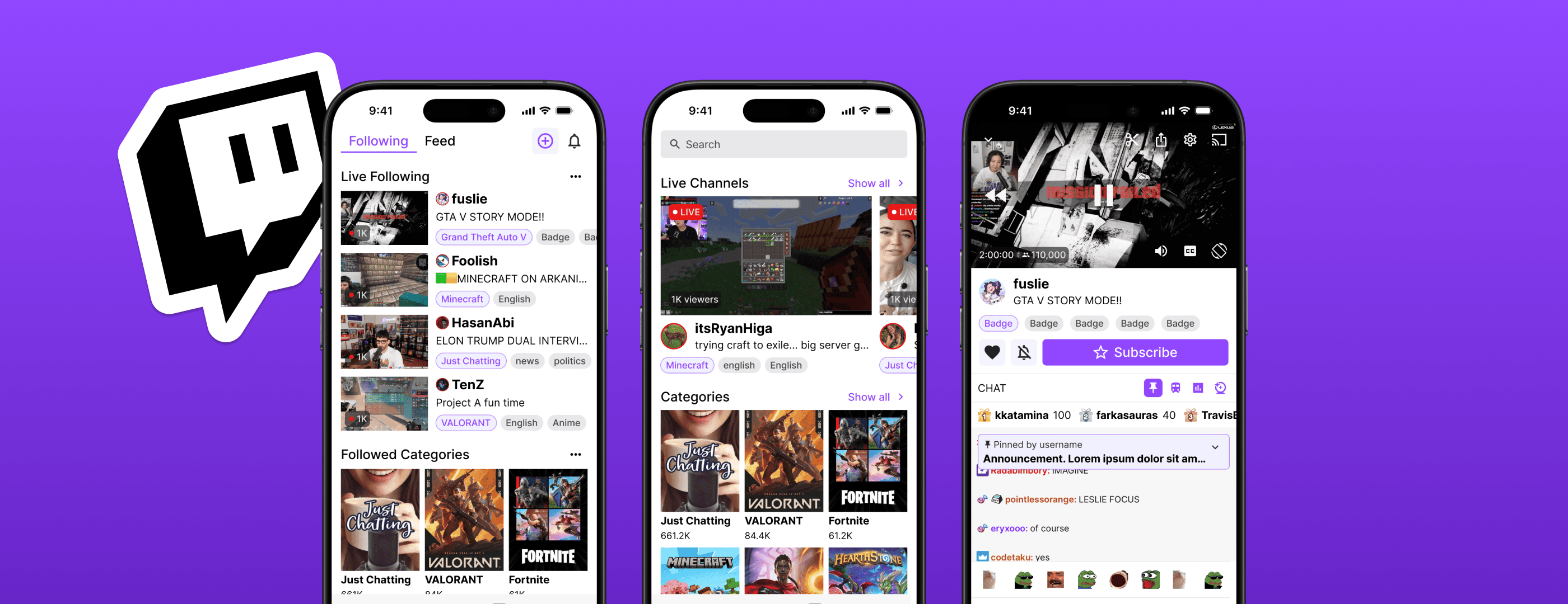
Twitch's 2024 mobile update frustrated millions of loyal users by burying their following feed and breaking core viewing behaviors. As an avid Twitch viewer myself, I redesigned the mobile experience around what users want.
Problem
A platform update that alienated its own users
Twitch has 2.4 million average concurrent viewers and 50 million global app downloads. But mobile only makes up 35% of total views, well behind YouTube and TikTok. In 2024, Twitch responded with a full mobile overhaul: a TikTok-style feed, a new clips surface, a reorganized nav. Twitch's stated goal with the update was to "make the experience more fun so that they come back more often."
But it didn't land. Users couldn't find their followed streams. Clips cut off important content. Chat overlays covered the video. Long-time users felt the app had been redesigned for growth metrics, not for them.
"The app is dogsh*t."
— Cinna, Twitch streamer, 2025
How might we improve Twitch's mobile viewing experience to boost engagement and retention, while preserving what makes Twitch unique for its viewers?
Research
What I found and what it changed
I pulled from user interviews, Twitch's own feedback forum, and a follow-up survey to test design directions.
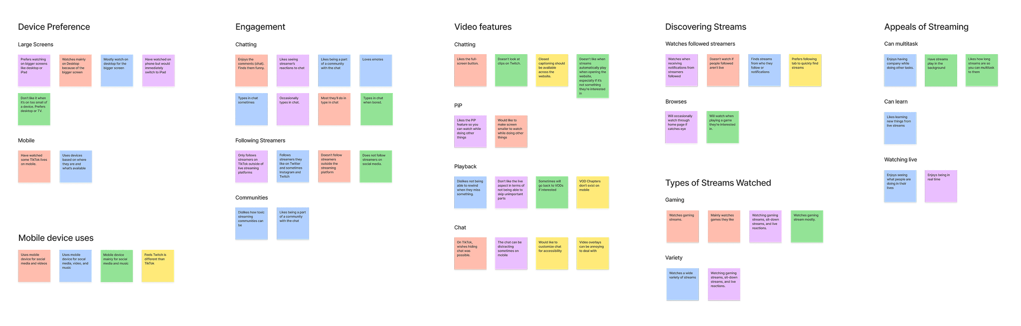
Affinity map from user interviews

Comments from Twitch's feedback forum
Mobile is a fallback, not a primary screen
Users prefer larger screens for live streams and switch to mobile when it's the most convenient option. That means people are coming in with low tolerance for obstacles.
Navigation was the top complaint
Users rarely browse for new streams on mobile. They're watching people they already follow. The new Live tab buried that under an algorithmic feed they didn't ask for.
Streams are background behavior
A lot of users put on a stream while doing other things. Intrusive overlays and banners don't add to the experience, they interrupt it.
Chat is the community
Even casual viewers want chat visible. Knowing other people are sharing the moment is a big part of why people pick Twitch over YouTube.
Competitor analysis pointed in the same direction. SOOP Korea was the only platform that handled chat well, a sidebar or small overlay that stays present without eating screen space. YouTube's community posts showed a social layer can work without replacing stream content. The bigger takeaway: Twitch's community-first identity isn't a weakness to fix by copying TikTok. It's the whole point.
Design
Three problems, three decisions
Homepage
Problem: Optimized for discovery, buried what users actually wanted to see.
Following is now the default view. Recommended content still shows up, but in a limited section that doesn't compete for attention. A new social feed surfaces creator announcements and events, giving people a reason to check the app between streams. Clips are folded into Home rather than given their own competing tab.
What I didn't go with
A toggle between "For You" and "Following." Survey results were clear: users wanted distinct pages, not combined ones. "Clunky" and "too crowded" came up a lot describing the current nav.
Clips
Problem: Horizontal footage forced into vertical fullscreen, cropping key content.
Users can now switch between fullscreen vertical and horizontal layouts. A toggle during clip creation lets creators control cropping before they share, rather than losing footage to a forced frame.
Worth noting
Landscape is opt-in, not the default. Most people keep rotation locked, so forcing it would trade one bad default for another.
Video & chat
Problem: Overlays either blocked the stream or were unreadable, and banners couldn't be dismissed.
The redesigned chat layout opens up more room for messages. Banner tabs let people toggle Hype Train notifications independently of chat itself, control without losing the feature. A short rewind buffer lets viewers catch what they missed without leaving the stream. Other additions include:
- Closed captions. Reserved space in the player, an accessibility gap in the original.
- Emote overlays. Quick access to emotes in fullscreen mode.
On rewind
The most technically constrained piece here. It works within realistic backend buffer limits, not full DVR playback.
Reflection
Looking back
Following-as-default is the biggest departure from the current design, and it has an obvious edge case: new users with no one followed yet would land on an empty screen. A smooth onboarding flow pointing them toward recommended streams could close that gap. It's the first thing I'd want to A/B test.
A few things this project made clearer:
The research changed the design
This was my first time running real user research with strangers. I started this project as a Twitch viewer with my own opinions about what was broken, and talking to other users surfaced priorities I hadn't considered.
Trends aren't always the way to go
There is no doubt short-form content is growing. But simply following industry standards and practices can cost companies the users they already have by abandoning what makes their product unique.