Reimagined VagiVital's brand and site to normalize feminine health for a wider audience
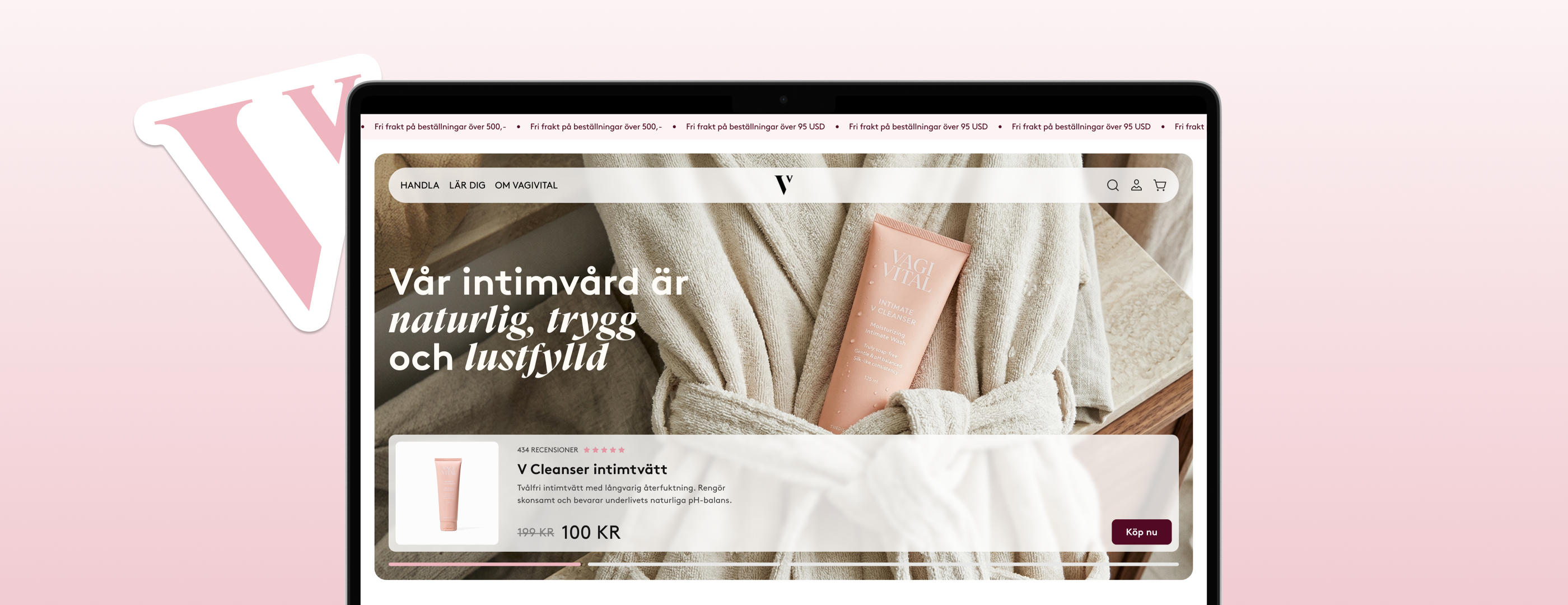
VagiVital, a Swedish intimate care brand, had already been through one redesign, but still read like a smaller regional player next to the U.S. brands it wanted to sit alongside. This was a full brand and web refresh built to help it fit naturally into that same routine, while also reaching a younger audience.
Problem
Stuck in a niche, missing a market
The existing customer base was mostly women (40+) going through menopause, and overall conversion was already low. The bigger goal, though, was fitting in next to leading U.S. personal care brands, with reaching a younger audience as a second priority, ideally without losing the customers VagiVital already had.
An earlier redesign had already softened the palette and warmed up the photography. But it still read a step behind the U.S. brands VagiVital wanted to sit alongside, not quite modern enough to keep up.
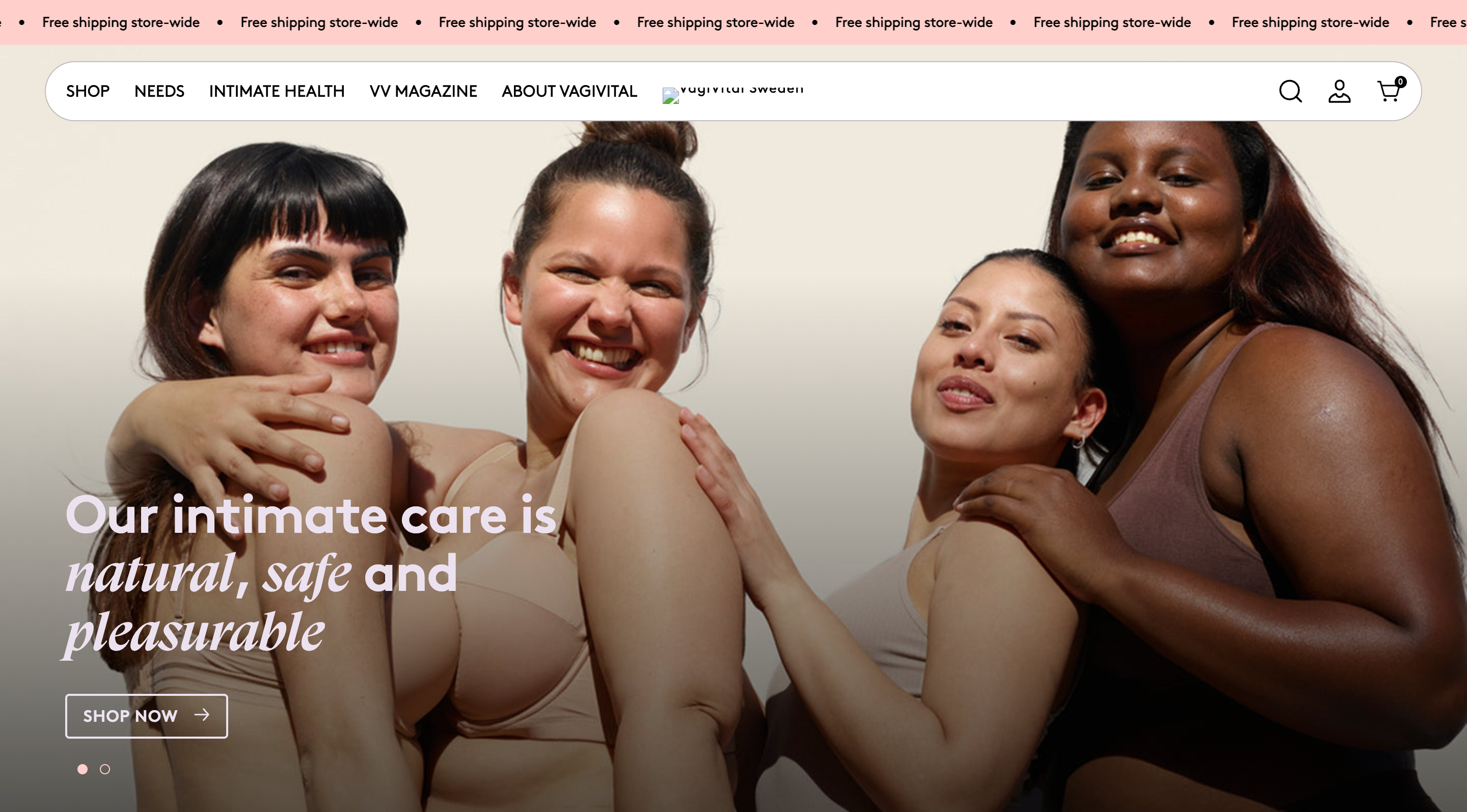
Old VagiVital Hero
How might we rebrand and redesign VagiVital's site to feel like a natural fit alongside leading U.S. brands, bring in a younger audience, and keep the trust of the customers already buying from them?
Research
What I found and what it changed
Aesthetics alone don't drive sales. Looking at leading U.S. personal care brands, rhode, Caudalie, and Summer Fridays, plus Clarity insights from the current site, gave us real building blocks to work from instead of guesses.
Consistency and access mattered more than flash
Caudalie's sticky buy column (built to keep the CTA in view longer) and Summer Fridays' feature-driven product page structure both prioritized quick access over decoration.
Users weren't scrolling far, and carousels went untouched
The clearest signal from Clarity, even without saved recordings, was low scroll depth and near-zero interaction with carousels. That pushed us to move key info higher and cut carousels down.
The existing audience skewed older, and conversion was low
VagiVital's current customers were mostly women going through menopause. Bringing in a younger audience meant the brand and site needed to speak to two different comfort levels with the topic at once.
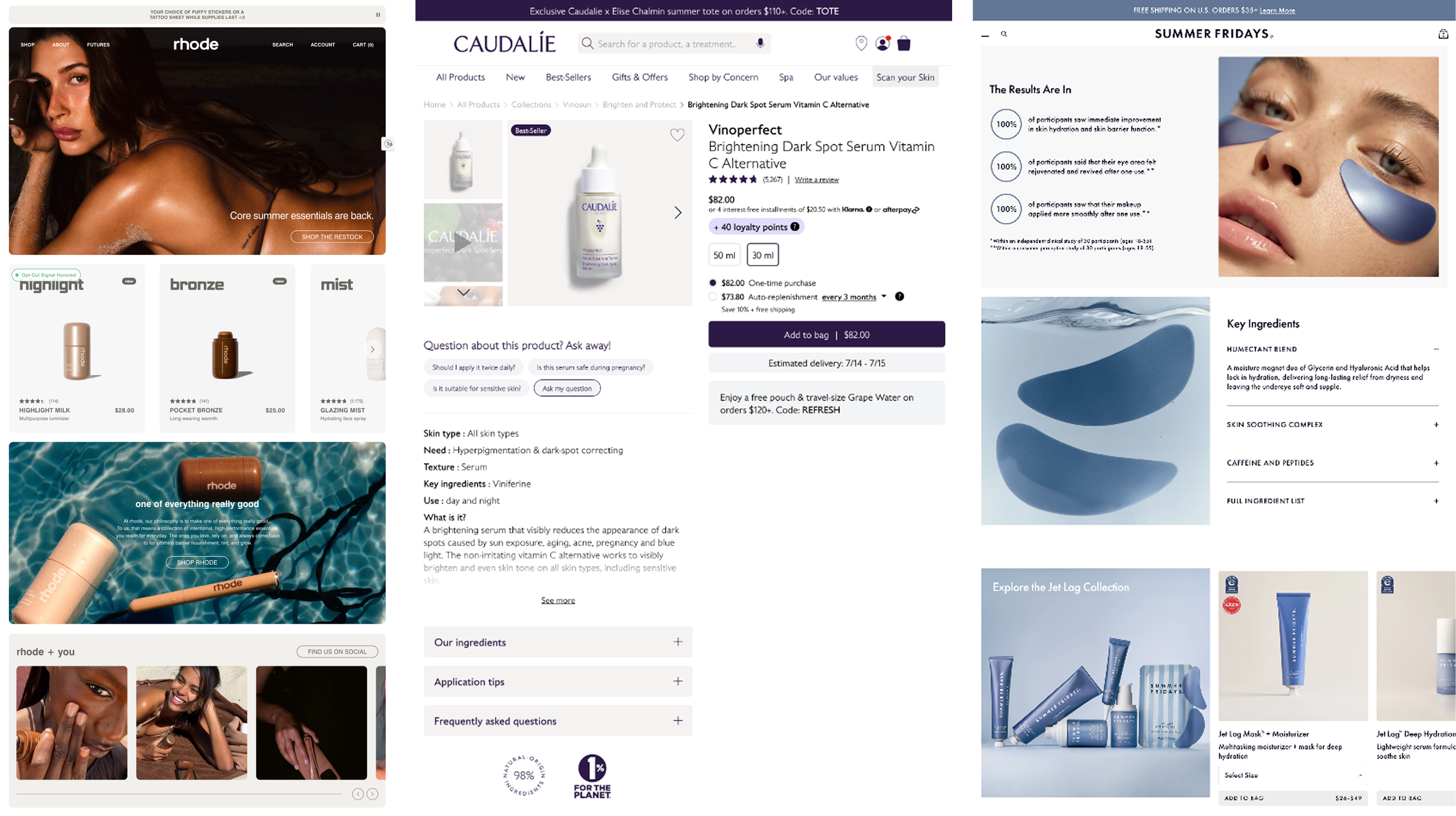
Notable competitor screenshots
Between the competitor pages and our own data, the direction got clear fast: cut the fluff, keep the essentials in easy reach, without losing what already worked for VagiVital's existing customers.
Design
Three problems, three decisions
Brand identity
Problem: Even after warming up the palette and photography, the identity still read like a smaller regional player next to the U.S. brands VagiVital wanted to sit alongside.
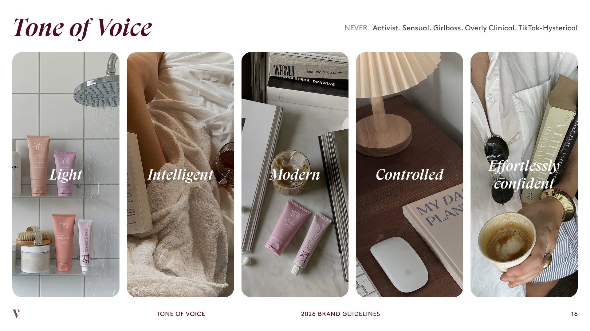
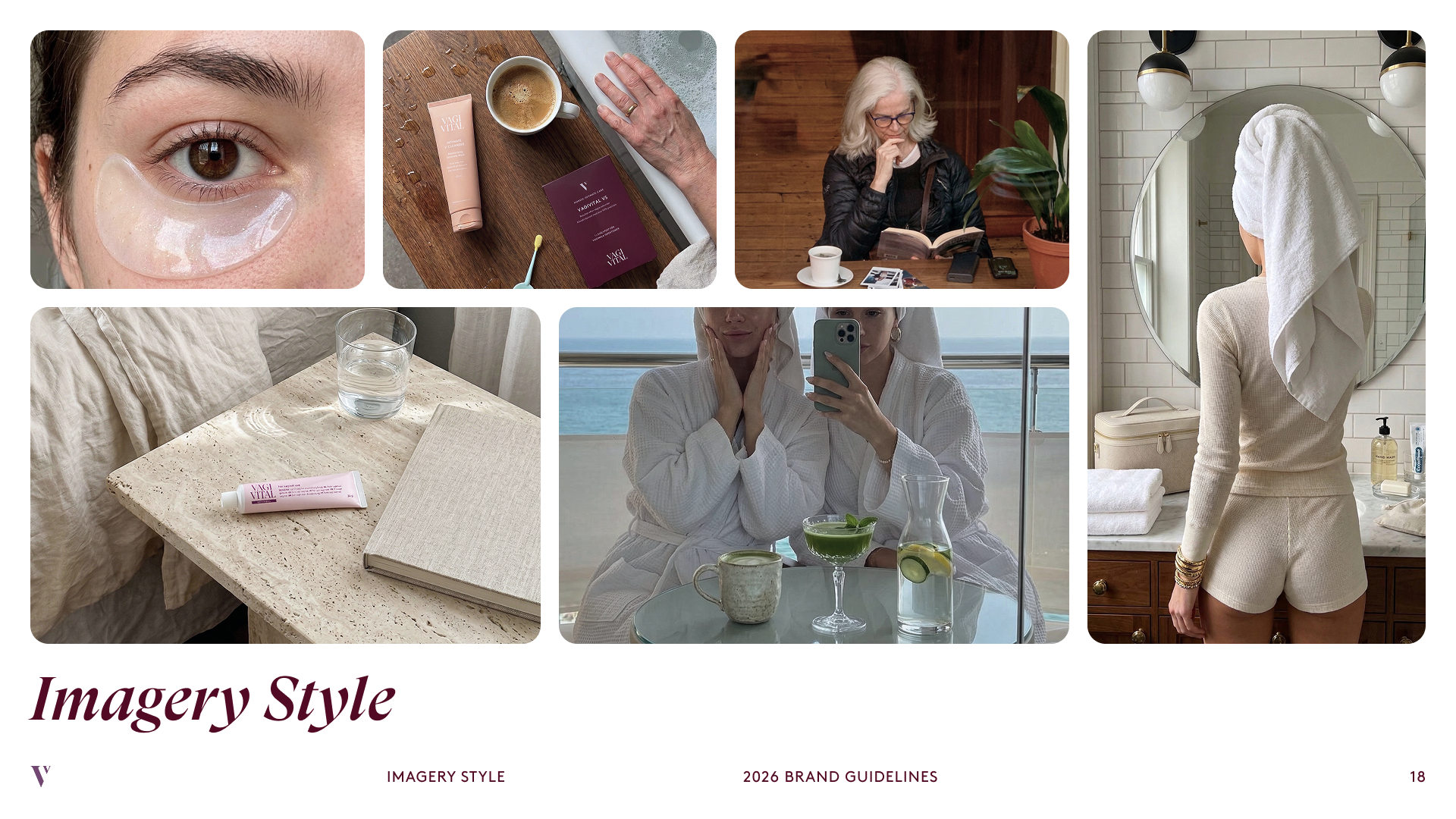
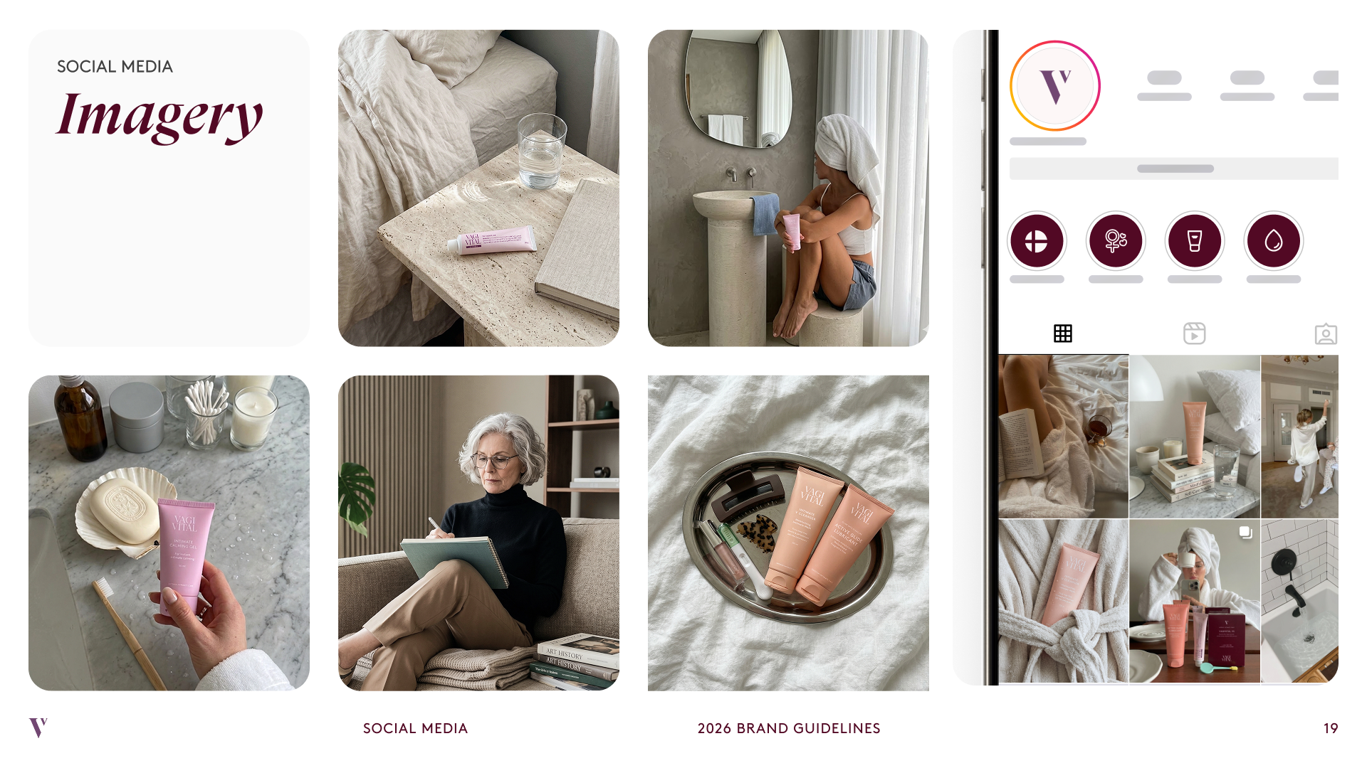
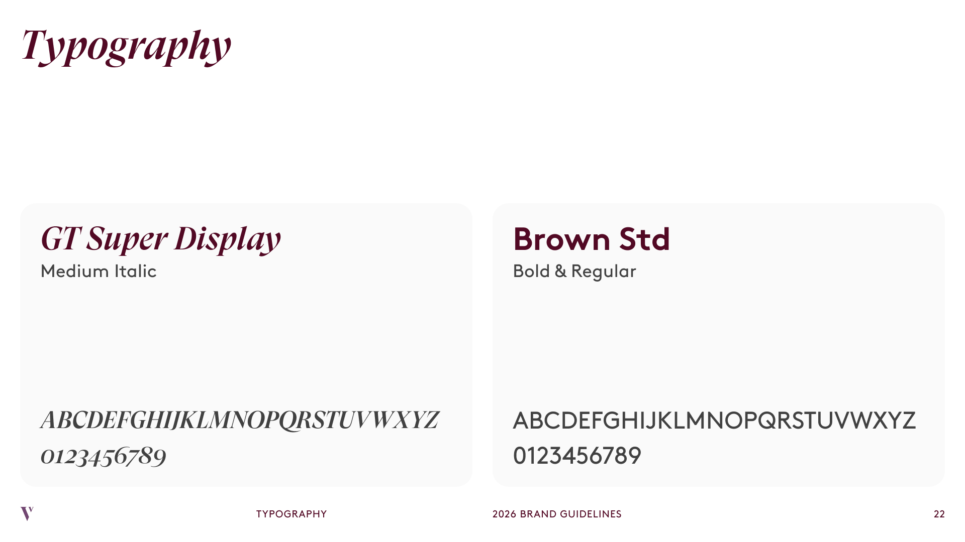
We pushed the palette further than the earlier redesign's creamy, muted tones into a lighter, more luxurious yet relatable identity, closer to rhode's rounded corners and open white space than a pharmacy shelf, and every other decision on the site traced back to it. Photography also had to stretch across age ranges, so the existing 40+ customers saw themselves in the new site, not just the audience we were adding. A less expected part of the look came from AI-generated product photography, matching the candid, modern aesthetic without a full shoot.
Worth noting
Partway through, the client brought in a brand strategy agency to rework their tone and target audience, and we reframed our existing work to fit it instead of starting over, adjusting things like imagery style. The one real disagreement was the color palette, we held the line on AAA-safe contrast and stronger primary colors, and found a compromise inside that constraint.
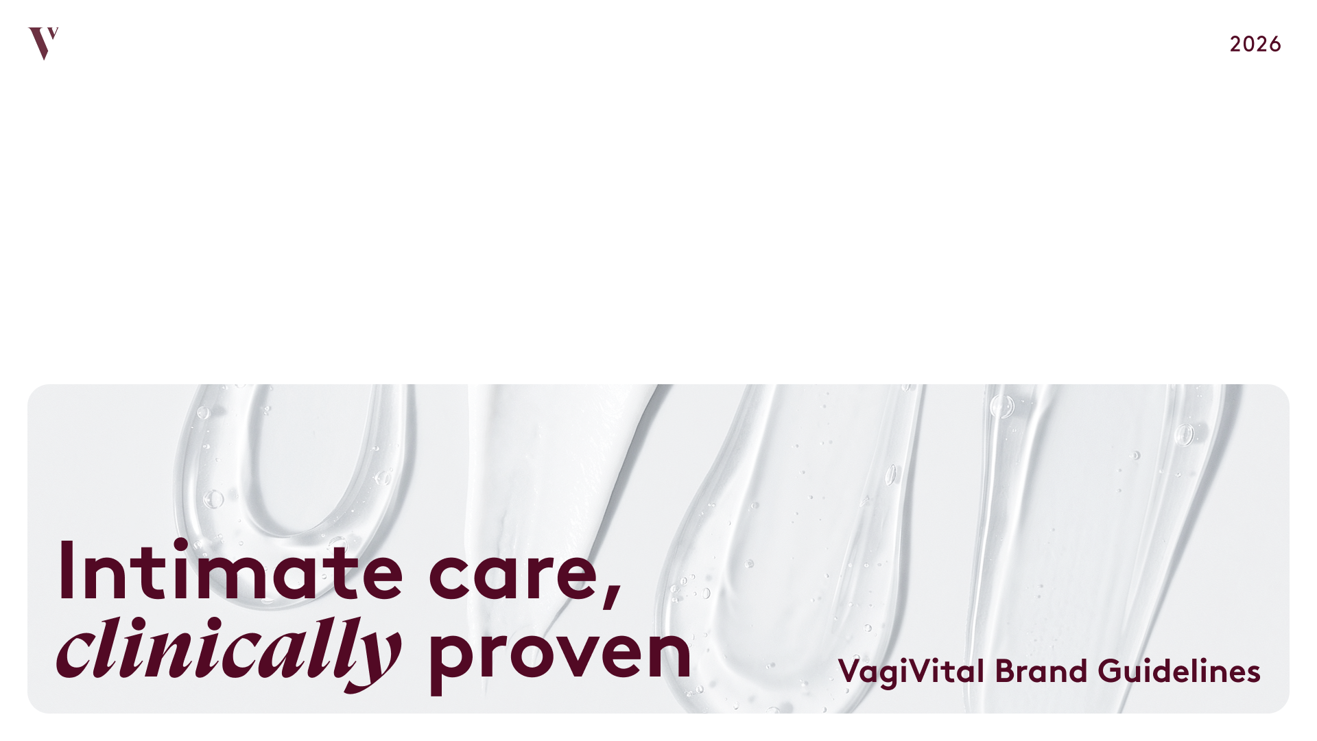
VagiVital Brand Guidelines
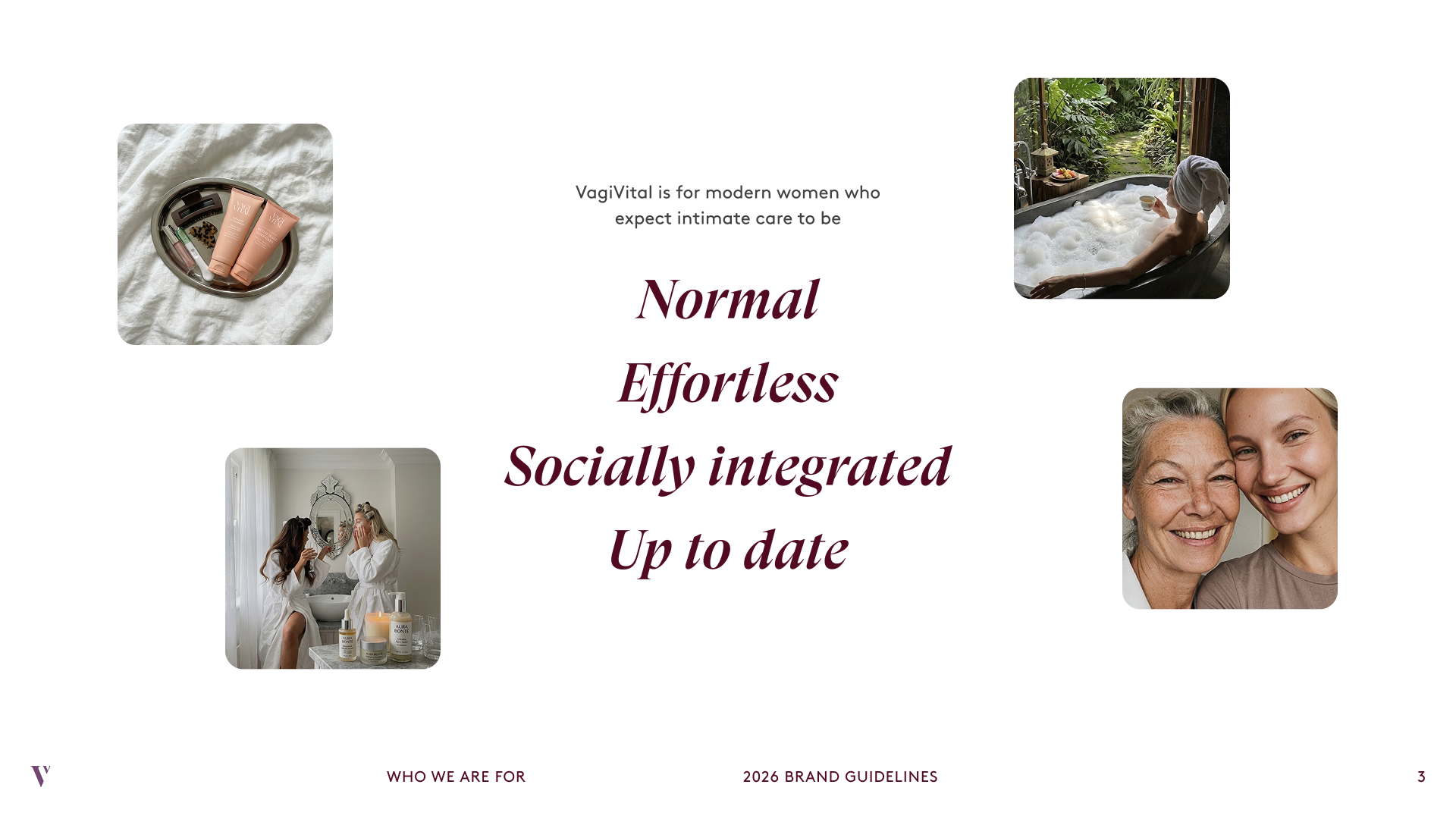
Who We Are For
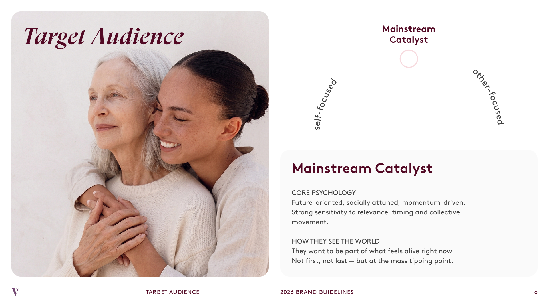
Target Audience
Tone of Voice
Imagery Style
Social Media Imagery
Typography
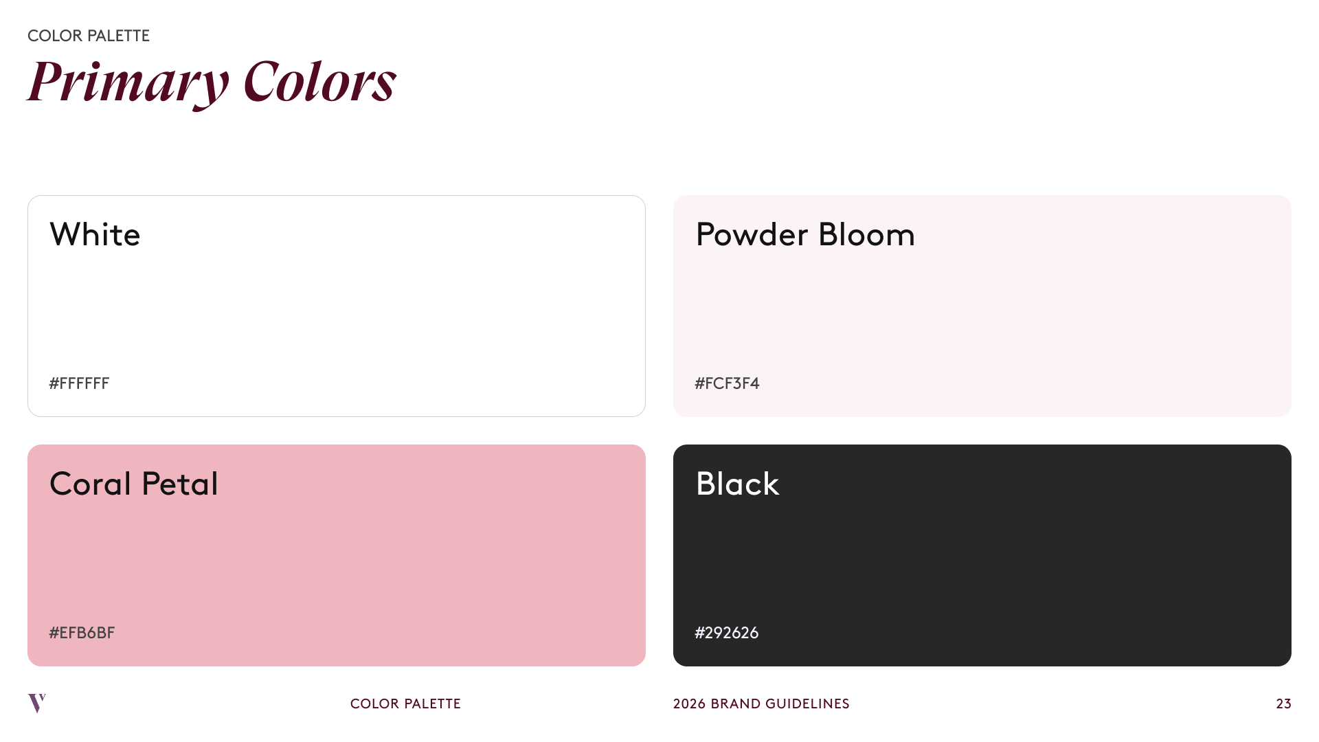
Primary Colors
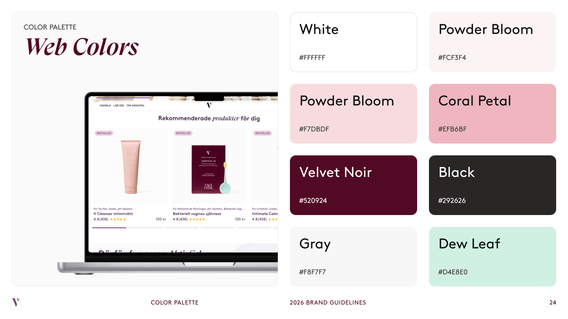
Web Colors
Product page
Product page
Problem: An earlier redesign had introduced some solid info sections, but they weren't applied consistently across products, and the path to purchase wasn't strong enough next to sites like rhode or Summer Fridays.
Old product pages had sections that didn't always match the product they were on (a bundle promo unrelated to the current page) and were often missing basics, like what the ingredients actually did. The new structure leads with key benefits and stats, then ingredient detail, step-by-step use, reviews, FAQs, and bundle options, no filler. The buy column stays sticky on desktop and becomes a pinned button on mobile, trimming the descriptive copy so it never competes with the CTA for space.
Bundle modal. Added to show exactly what's included in each bundle, something the old pages didn't make accessible, especially in the buy section.
What I didn't go with
A longer, story-driven page like rhode's. Given how little people scrolled or touched carousels on the existing site, a page that depended on scroll depth to deliver key info was the wrong bet here.
Navigation
Problem: The original menu had too many options with no clear hierarchy, so it was hard to figure out where anything lived.
We reorganized five loosely grouped tabs (Handla, Behov, Intim hälsa, VV Magazine, Om VagiVital) down to three (Handla, Mer om intimhälsa, Om VagiVital). Intim hälsa and VV Magazine, the blog and other education content, got folded into one tab too, Mer om intimhälsa, instead of staying split across two. We'd suggested calling it "Learn," but the client changed it to their own wording.
Search upgrade. Added quick suggestions for popular tags, products, and blog articles directly in search, instead of a blank search bar.
Worth noting
Handla and Behov weren't actually two different tasks, they were two different questions leading to the same shelf. Splitting them into separate tabs implied a bigger distinction than existed. Consolidating them into one meant one less decision before someone could start browsing.
Navigation
Outcome
Redesigned, shipped, and live
VagiVital's rebrand and redesign went through dev handoff and is now live. I don't have post-launch conversion or Clarity data on hand yet, I'm expecting to get it and will update this section once I do.
Reflection
Looking back
What I'd do differently
Every reference brand I researched, rhode, Caudalie (French, but positioned heavily for the U.S. market), and Summer Fridays, skewed American or U.S.-facing. That wasn't an oversight, fitting into that same routine was the actual goal. But I never checked whether a Swedish or Nordic audience reads that brand tone, color, and photography the way a U.S. audience does. Next time I'd pull in at least one regional reference alongside the international ones, instead of assuming one playbook covers both.
A few things this project made clearer:
Holding ground under pressure is a skill, not a fight
Midway through, the client's brand strategy agency introduced a new tone and audience direction we hadn't designed around. We reframed the existing work to fit it instead of starting over, and when the one real disagreement came down to color palette, we held the line on AAA-safe contrast and higher-impact primary colors instead of just deferring to preference.
A small data point changed the whole page
Low scroll depth and dead carousels weren't a reason to fix the carousel, they were a reason to rethink how much the page asked people to scroll at all. That's what pushed the shorter, benefit-first structure over a longer, story-driven one.